- Define an Action in your Flatfile blueprint or in your code
- Create a Listener to handle the Action
For complete implementation details, see our Using Actions guide.
Types of Actions
Built-in Actions
Resources in Flatfile come with severaldefault built-in actions like:- Export/download data
- Delete data or files
- Find and replace (Sheets)
Developer-Created Actions
You can create custom Actions to handle operations specific to your workflow, such as:- Sending data to your API when data is ready
- Downloading your data in a specific format
- Validating data against external systems
- Moving data between different resources
- Custom data validations andtransformations
Where Actions Appear
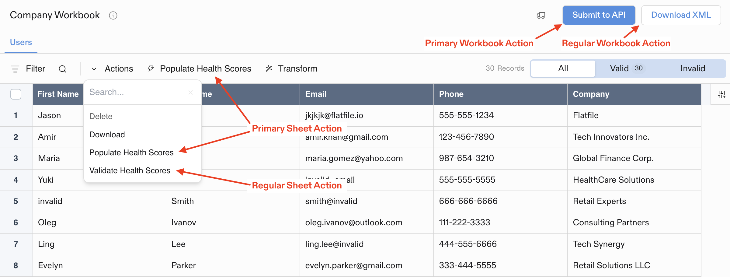
Actions appear in different parts of the UI depending on where they’re mounted:- Workbook Actions: Buttons in the top-right corner of Workbooks
- Sheet Actions: Dropdown menu in the Sheet toolbar (or top-level button if marked as
primary) - Document Actions: Buttons in the top-right corner of Documents
- File Actions: Dropdown menu for each file in the Files list
Example Action Configuration
Every Action requires anoperation (unique identifier) and label (display text):
primary status, confirmation dialogs, constraints, and input forms. See the Using Actions guide for more details.